3.4.14. Spectrum Plots
Spectrum Plots display the FFT computed from the current data block’s samples for one or more channels. These plots:
Require the selection of the following items on the Plot Creation tab before adding them to the plot grid:
- One or more primary data channels.
- Optional order based cursor specification(s) on the Trigger/Phase input.
Extend the Plot Menu with an additional sub-menu described below.
Do not add extra pages to the Plot Setup dialog.
Provide an additional user interaction mechanisms beyond the ‘standard’ ones described in the Plot Interactions section. This allows users to place fixed frequency cursors on the X axis as described below.
Spectrum plots have three sub-types depending of the data curve being displayed:
- Magnitude plots display the instantaneous FFT spectrum for each data block.
- Envelope plots display the historical maximum (peak hold) of the FFT spectrum for each frequency value.
- Magnitude&Envelope plots display both curves listed above.
Spectrum plots provide additional cursor types beyond the standard ones introduced earlier. These cursors are drawn as vertical lines at a given X axis position and will display the numerical values of all data curve intersects at that X (frequency) value. These X axis cursors have three sub-types:
Fixed Frequency cursors can be created by clicking inside the plot’s X axis area. Once created, fixed cursors can be removed by clicking on their triangular markers below the X axis. They can also be moved to a different frequency value by dragging the same markers horizontally.
The Maximum Peak cursor can be enabled or disabled on the right click pop-up menu invoked over a selected spectrum plot. These will be drawn at the location of the biggest FFT peak.
Order (or EO) cursors can be added at plot creation time by specifying the list of desired speed parameters and order values on the “Trigger or Phase” input of the plot creation tab. The list can be space or comma separated and has to contain EO cursor specifications in one of the following forms:
Speed1:Order1 Speed2:Order2 ...
Speed1 Speed2 ...
Order1 Order2 ...
The first form specifies both the speed parameter and the order value used to calculate the cursor’s frequency. The second form will display first order cursors for all listed speed parameters. The third form is accepted only if the channel(s) have a default reference parameter (must be speed) assigned to them, which is then combined with the listed order numbers.
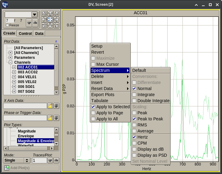
The Plot Menu extension displayed for spectrum plots provides the following functionality:
- Max Cursor: Toggles display of the X axis cursor drawn at the maximum spectrum peak location.
- Default: Resets all the options configurable on this menu to their default values.
- Domain conversion options. These are performed on a per plot basis and require a properly configured Integration Table.
- Differentiate: Display the plot’s data curves in the differentiated domain. (Example: displacement to speed.)
- Normal: Display the plot’s data curves without any domain change.
- Integrate: Display the plot’s curves in the integrated domain. (Example: speed to displacement.)
- Double Integrate: Display the plot’s curves in the double integrated domain. (Example: acceleration to displacement.)
- Scaling options. These allow the spectrum to be displayed using scaling options different from the channel’s default configuration.
- Peak: Display the plot’s FFT data scaled as peak amplitude.
- Peak to Peak: Display the plot’s FFT data scaled as peak to peak amplitude.
- RMS: Display the plot’s FFT data scaled as mean square average amplitude.
- Average: Display the plot’s FFT data scaled as linear average amplitude.
- Hertz: Scale the plot’s X axis in Hertz units.
- CPM: Scale the plot’s X axis in CPM (Cycles Per Minute) units.
- Display as dB: Scale the plot’s Y axis in decibel units.
- Display as PSD: Scale the plot’s Y axis in PSD (Power Spectral Density) units.
- Set Nominal Level: Available in dB scaled mode only. Sets the data level that corresponds to 0 dB.
Note
The data curves displayed on these plots are the result of combining the FFT and peak data produced by the APEX DV data processor. This will insert extra points between the regularly spaced FFT values at the locations of the extracted and interpolated peaks.
Tip
Spectrum plots will display the limits associated with the assigned data channel. For limits to be visible a properly configured limit file must be loaded into the application. Also, limits are only shown on plots that display a single channel.
