1.4.18. Campbell Plots
Campbell Plots display collected spectral peak responses from one or more channels over a two dimensional grid. These plots:
Require the selection of the following items on the Plot Creation tab before adding them to the plot grid:
- One or more primary data channels. Some display modes are only supported for a single channel plots.
- One optional X axis reference parameter or channel stat.
- One phase reference channel or speed parameter.
Extend the Plot Menu with an additional sub-menu. This menu contains shortcuts to settings also available on the Campbell specific Plot Setup dialog page. See descriptions there.
Add an extra page to the Plot Setup dialog with Campbell plot specific settings.
Provide additional per axis user interaction mechanisms beyond the ‘standard’ ones described in the Plot Interactions section.
Campbell plots display spectral peak responses collected over a two dimensional data grid. The X axis coordinate of the collected data can be time or a user selected parameter. If the X axis data is time then the plot will scroll right to left the same way as the History Plots. The left Y axis always shows frequency units. If the assigned X axis variable is a speed parameter then the plot will have a second Y axis on the right that displays orders. If an order axis is shown its range settings will be locked to those of the X and left Y axes and will not be independently settable.
The collection grid has a limited number of ‘bins’ in both directions. Each grid cell will always contain only one response (if any), the maximum one seen so far. In addition the plot also limits the maximum number of non-empty grid cells, Both of these measures serve the goal of allowing extended monitoring sessions without the danger of running out of memory due to Campbell plots “growing” without limit.
Campbell plots do store and display the phase of collected responses. However, these values are largely meaningless unless a phase reference is specified when the plot is created. The phase reference can be an other channel or a speed parameter.
All displayed plot axes support a “collapse plot” action that allows the user to select a parameter, frequency or (optionally) order line by dragging the mouse cursor along the axis. Upon releasing the mouse button the plot will “collapse” into a regular Cartesian XY plot along the selected “slice”. Using the right-click menu “Revert” action will restore the original view.
Campbell plots can use the limits associated with the assigned data channel. For limits to be visible a properly configured limit file must be loaded into the application. Also, limits are only shown on plots that display a single channel.
Campbell plots support a variety of display modes. Most of these use data “tic marks” drawn over the data collection grid. The height, color and orientation of these tic marks is used to encode information about each response. The exception is the “ZMOD” display mode which uses a continuous “rainbow” color map to represent response magnitudes.
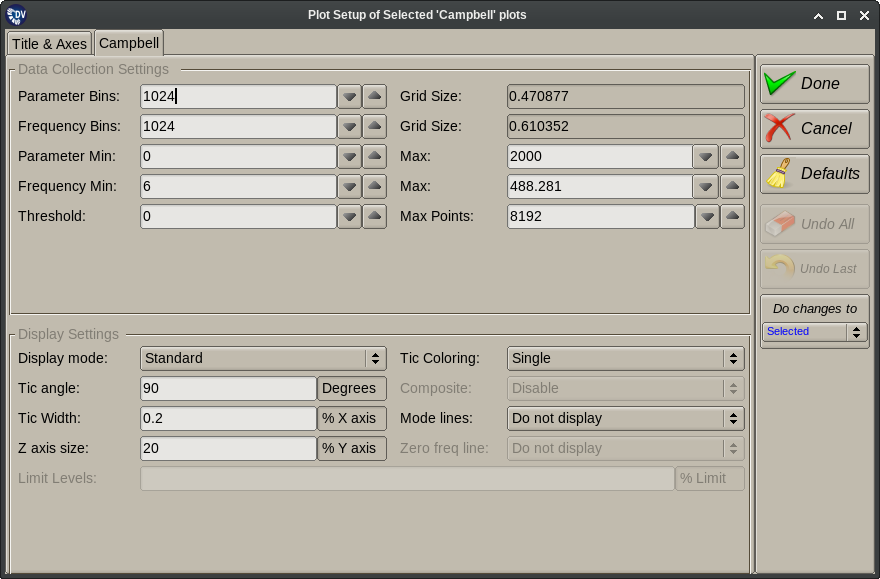
The Campbell specific Plot Setup dialog page is divided into two halves. The top half controls the data collections options. Changing any of these values will reconfigure how the plot collects data, and will also clear any data collected so far.
- Parameter Min/Max/Bins/Grid: Configure the X axis collection grid.
- Frequency Min/Max/Bins/Grid: Configure the Y axis collection grid.
- Threshold: The minimum peak amplitude the plot will collect.
- Max Points: The maximum number of non-empty grid cells.
The bottom half of the panel configures plot display options. Changing these does not clear the plot.
- Display Mode: Controls how the plot is drawn.
- Standard: Two sided tic marks with a horizontal line at the center. The center point corresponds the parameter and frequency location of the response.
- Lines: Same as above except no horizontal line at the center.
- One Sided Tics: Entire tic mark is drawn above the response coordinates.
- Circles: Markers are circles drawn centered at the response coordinates. Diameter represents magnitude.
- Squares: Markers are square boxes drawn centered at the response coordinates. Length of sides represents magnitude.
- Phase: Markers are uniform length, their direction represents the phase of the response.
- Z-Mod: No markers are drawn. Instead a continuous color image is shown with a color key painted in the top left corner of the plot. This mode is not available for multi channel plots.
- Tic Coloring: Controls the use of colors when drawing the plot (except for the ZMOD display mode).
- Single: All markers are drawn with the same color. This is the only mode supported for multi channel plots.
- Noise: Colors are used to indicate which responses are marked noisy during data processing.
- Phase: Colors are used to encode the phase of the displayed responses. A color key “wheel” is also displayed on the plot.
- % Limit: Colors are used to represent whether responses are within limits or not. This requires a loaded limit file.
- Tic Angle: The angle at which line mode tics are drawn. 90 degrees (vertical) is the default.
- Tic Width: The width of the horizontal marker placed on line tics as a percentage of the X axis size.
- Z Axis Size: The length of the plot’s Z axis (used to scale responses) as a percentage of the Y axis size.
- Composite: Unused. For future expansion.
- Mode Lines: Enable or disable the drawing of mode lines when limits are available. This is done on single channel plots only.
- Zero Freq Line: Enable or disable drawing of collected time domain statistics values. If drawn these are shown with a zero frequency.
- Limit Levels: Used only in the “%limit” color mode. Sets the limit levels where different colors are used.

